Showing posts with label engl706. Show all posts
Showing posts with label engl706. Show all posts
Monday, May 4, 2015
Monday, April 20, 2015
ENGL706 - Blogging Queen (as long as you want complaints)
Bringing my learning into what I do is probably one of the
most challenging parts of post-grad I’ve been expected to perform. There’s
usually not a 1 to 1 correlation- like ‘oh, I learned about social networking,
so now I can tutor using social networking’ or something like that. Usually, at
best, classes often introduce me to an array of tools (like Popplet!) that I
didn’t know existed and those tools help me get ideas across, or are excellent
for me to share with my students who need them.
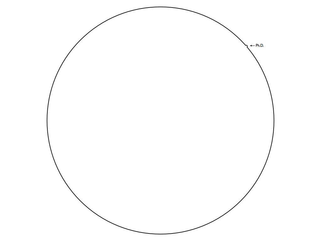
(that tiny blip is supposedly a PHD in contrast to global knowledge. So tiny. Wow!)
As a tutor and sometimes technical writer, I assume the
majority of the information I produce or share day to day is transmitted visually
or auditory. Visually through the learning supplements and flyers I make and auditory
because tutoring is mostly me giving verbal instructions and the student acting
them out. Although we put out surveys, most of the tutoring feedback comes
in-session from the satisfied (or agitated) student. Likewise, my flyers don’t affect
event attendance nearly as much as the method of distribution for them, so it
can be difficult to tell if I’m using the best methods.
I stopped centering things on my flyers, though, and now I
use serif fonts pretty much exclusively, so that’s a definite start. When
working on a tight deadline, those to ideas are the first that come to mind!
Invention is likewise a bad time for me. Probably because
when you start an MA, you realize there’s just…such a large gap between you and
everyone else. You and PHD, you and Professors, you and technical students- it’s
a self-confidence nightmare!
That’s why invention has become kind of…not good for me. You
can do a project on anything in the world you want (usually, if you can sell
it) and starting out asking “well, what do I like?” usually ends in things like
My Little Pony, social justice, and gender studies. All of these are great,
valid areas that could be looked into, but when it comes to getting a job or
paycheck, the gap widens between there. This leads to disasters where you make
a sensible choice, only to figure out you don’t like something nearly as much
as you thought you would, or that the scale of it makes successfully finishing
it less possible and probable all at once.
Not to mention that whole “it’s all been done” thing. Yadda
yadda.
Visual rhetoric (so far) hasn’t really helped me cope with
any of these feelings yet. What it has (sort of) done is make the pool of study
to pull from a little wider. Before, I would have never thought you /could/
study something like album covers academically. Delivery methods are a work in
progress too- I still have some trouble working my mind around the idea of a
website as a final, even though it sounds super neato.
Not that I necessarily /didn’t/ know it before, but I do
feel like this class has happened home how multimodal approaches really are
best. I know I learn best when a course tries several different approaches. Of
course, you always end up hating some, and loving others, but getting out of your
comfort zone is always embarrassingly educational. I may not have loved Popplet,
but I did love learning about using it, and can definitely see how that could
be useful one day in the future.
Monday, March 23, 2015
ENGL706 - Belated Tidings of Annotation
George, D. (2002). Visual Communication in the Teaching of Writing. College Composition and Communication, 4(1), 11-39. Retrieved from JSTOR.
In this piece, George refers to the current culture as “aggressively visual” which is a term I adore. I want to use this as part of my basis when asserting that syllabi should have a visual design steeped in good rhetoric. Students may not be able to access the document in the multi-faceted layers that a practiced rhetorician can, but having been raised on images, they will come “pre-programmed” with the cultural brainwashing of good and bad visual design. The things that are well designed stuck, and so a good syllabus should join those ranks no matter its purpose or country of origin.
This idea of visual rhetoric being prevalent in culture also applies to online syllabi and calendars, which I would like to analyze on the ODU end of my project. Without the necessary visual literacy, how is a student to know a hyperlink on sight, or what the difference is between a menu bar and a context menu? This will be document specific, but those “moving parts” in e-syllabi are part of the visual culture that upcoming students are raised in.
On page 26, she makes the argument that web pages must be “navigable” and that this ties into graphic design heavily. Although an online syllabus need not necessarily be a web page, I would argue that it, too, must be navigable. Syllabi usually have several pages, and a student who struggles to find information in an ill-formatted document sans bolding, highlighting, or proper paragraphs and spacing, will not use the document for its intended purpose. While a little different than a web page’s navigation bar, I think the coherent thread of thought for “getting around” on them is similar.
Likewise, George’s ideas about what does and does not constitute a visual argument are lax without being nonspefic. She says “All sorts of visuals make assertions and develop those assertions with visual information” which is absolutely true of syllabi. Even in the JP syllabus, there is a visual argument made by the table the information is presented in (albeit a less hearty argument than some of the ODU syllabi I have):

The Japanese syllabus mostly replies on color usage and layout- two tools out of a full box to choose from. I look forward to seeing if the use of less stylizing comes with shifts in purpose, or if this is a cultural difference (since Japan has ways of emphasizing characters that the US does not). This in itself is a visual argument that only highlights the section headers. Down below this screen grab is a numbered list of sections that will be covered, which is also a part of the visual argument. Even then, since the list is not indenter, nor any part of it set apart from the others, it reads as a block of undistinguished text and implies no one section is any more important than the others.
All in all, although this text focuses on the composition classroom, and the history of visual argument’s growing importance in teaching, there are small pearls of wisdom RE: the importance of the visual argument, and of coherency that are extremely important.
Wednesday, March 18, 2015
ENGL706 - Connect ALL The Things!
So Kress talks about different genres in the same "text" that take on different shares of the communicative burden, which is actually an interesting concept. I'd say any student who has ever written anything remotely hypertextual, or who has included an infographic/chart to represent something they've written about has experienced the singular pleasure of necessary appendixes. These vial elements often help make a point simply by existing as factual proof to support an argument that at least, in part, is visual. Kostelnick talks about Tufte's beliefs in his "The Visual Rhetoric of Data Displays: The Conundrum of Clarity" especially the "lie factor". This reminded me of the students, and how each of them diagrammed the onion slide in their lab reports in Kress' readings. After all, neither of the students aimed to be misleading in what they drew. Rather, one gave a more literal interpretation (still informed by the teacher's verbal instruction) and the other interpreted what she saw into a larger diagram that implied representation by being incomplete at the edges. If neither is intended to mislead (and most likely, objectively speaking, neither is fully "incorrect") then how can they be classified? Which is "more" or "less" clear?
Thinking more about these diagrams, Welling's work on"Ecoporn"also comes to mind. Could the consumer produced diagram of the human eye count as a subgenre of Ecoporn? It provides its own brand of fantasy about the human body. The colors are saturated higher, the lines and layouts cleaner than a human body- often, when dissecting, what a chart looks like and what you find inside a once-living creature seem like apples and oranges. In this way, it is designed for the same kind of "quick, easy visual consumption" as pictures of sunsets and rainforests that casually leave the truth of the place out of frame are. Even if ecoporn isn't the correct term (although I feel like an argument can be made for human bodies and organisms to be self-contained ecosystems on a microscopic level) then I do believe that both of these concepts have similar themes when it comes to what can make them and their design problematic.
Thinking more about these diagrams, Welling's work on"Ecoporn"also comes to mind. Could the consumer produced diagram of the human eye count as a subgenre of Ecoporn? It provides its own brand of fantasy about the human body. The colors are saturated higher, the lines and layouts cleaner than a human body- often, when dissecting, what a chart looks like and what you find inside a once-living creature seem like apples and oranges. In this way, it is designed for the same kind of "quick, easy visual consumption" as pictures of sunsets and rainforests that casually leave the truth of the place out of frame are. Even if ecoporn isn't the correct term (although I feel like an argument can be made for human bodies and organisms to be self-contained ecosystems on a microscopic level) then I do believe that both of these concepts have similar themes when it comes to what can make them and their design problematic.
Ideas (in the form of questions)
- Can commercially marketed scientific diagrams be considered as a type of ecoporn, given that they are both constructed for the same type of consumption? I think this is a fascinating idea, since it contains the argument that purpose = grounds for classification. This might all come down to semantics in the end.
- Is there a way to negate textual power entirely and still have a functional document? Textual hierarchy dictates what is more and less important (like numbered lists, bullets, bolding, etc.) but is there a way to avoid this prioritizing of somethings over others without sacrificing clarity? (yo creo que no- I think in lists and outlines and see a world without them as anarchy. It'll be interesting to see what the classmates think).
- Has the advent of digital media brought on a new wave of text/image meaning sharing? Is it more pervasive now than it was 10 years ago? 20 years ago? (that's only the 1990s *shudder*). Images can now be created and shared much more quickly than before, so does something like a meme fall under this same umbrella of multimodal thinking? (MEME STUDIES. Bring it on.)
Questions (also in the form of questions)
- Does delegating that all things have multiple layers of analysis in an effort to diminish the need to label mixed genre pieces make accessing multimodal messages more difficult for visual rhetoric scholars? A lot of VR is based on contextual and cultural understanding, so adding a two-tier layer system seems to add a lot of extra work into the equation.
- When trying to get across a complicated message or concept, does splitting the meaning between a strictly visual and strictly textual delivery method make for good VR? That is to ask, does it usually get the point across better than strictly one method or the other? This may be a type of study that has been measure in a scientific way, but I'd even be interested in opinions here. Does the visual/textual aid combo help you, personally?
- If the type of information is the same, but the delivery method is different (process list versus narrative account), is either one more or less accurate? I guess this depends on the instructions given, and the purpose. Is it also contextual? Like whether it's on a lab report or if you're explaining a lab experiment to a friend so they can do it at home later?
Thursday, February 26, 2015
ENGL706 - Heuristic In The Mud

Heuristic
Iconic Language
This is an image of a tree painted on the wall leading up to a hidden nook with acrylics. The ladder leading up to the loft is made of wood, as is the toy box at the base. I see an homage to childhood image here- to the tree house and to warm spring days. There's snow in the outside window's views, so perhaps they live somewhere that gets less than its fair share of warm days. I also see an attempt at making an indoor space seem more like a natural outdoor space.Cultural Language
I found this image on Tumblr, in a post about "great" home design ideas. Considering it was a part of that post at all, it's assumed to be "great". Additionally, this post, at present, has 7, 469 notes, which means it has either been liked or re-posted by that many blogs. That's fairly popular! The audience, in this context, is usually a range of ages crowded in the teens, to mid-twenties age, and heavier in girls than boys. These are people that either own a space of their own, or are of an age where they're old enough to imagine how they'd like to customize their space.
Theoretical Language
In this context, the tree is a symbol representing a child's tree house and bringing with it all the imaginary potential that comes with a creative change in environment. It is part of an upper-middle class home in a snowy area, showing the affluence to "afford" creative inside spaces. The wood of the ladder and toy box help to cement the attempted tie-in with nature that is not immediately present outside, as well as to imply that this set up is intended for a slightly older child (who can safely ascend and descend the ladder, but still needs a toy box). The surrounding yellows further set the scene as a bright, sunny day and mood brightener.
Thursday, February 19, 2015
ENGL706 - It's Better If It's Documented Because Reasons
Did I somehow miss the first AB? I could have sworn I posted one, but now I don't see it. I'm going to do two here, just in case. Sorry!
Hocks' research question is, what visual rhetorical devices are in play behind digital writing that mixes passive and active participation in consumption and creation, and how do these function in different contexts? She defines three terms to conceptualize the visual rhetoric discussed in her evidence: Audience Stance, Transparency, and Hybridity. Audience Stance is how a document creates a feeling of camaraderie with the reader and encourages them to interact. Transparency is how a document sticks to preconceived notions of print layout, web layout, etc. that the user is already familiar with. Hybridity is how the visual and verbal are mixed. She then uses these terms to assess an essay posted on the Kairos journal website, a paper for an ethnographic study put online, and a William Shakespeare website created by students who aimed to make a resource helping other students. She concludes that, through making web content and having it assessed by users, students learn best how visual rhetoric functions (as well as what works and what doesn't). This is a point for the 'learn by doing' school of thought. For my own research, Hocks' three terms are definitely now in my database, and will definitely help me assess the usability in the layout of the syllabi I've collected. I think this piece could help the class in a similar way- it's a vocabulary expander. A lot of these concepts can be sort of "felt" just by looking at a document, so having the correct terminology when it comes to actually discussing it becomes very handy very quickly.
Hocks, M. E. (2003). Understanding Visual Rhetoric in Digital Writing Environments. College Composition and Communication, 54(4), 629–656. doi:10.2307/3594188
Hocks' research question is, what visual rhetorical devices are in play behind digital writing that mixes passive and active participation in consumption and creation, and how do these function in different contexts? She defines three terms to conceptualize the visual rhetoric discussed in her evidence: Audience Stance, Transparency, and Hybridity. Audience Stance is how a document creates a feeling of camaraderie with the reader and encourages them to interact. Transparency is how a document sticks to preconceived notions of print layout, web layout, etc. that the user is already familiar with. Hybridity is how the visual and verbal are mixed. She then uses these terms to assess an essay posted on the Kairos journal website, a paper for an ethnographic study put online, and a William Shakespeare website created by students who aimed to make a resource helping other students. She concludes that, through making web content and having it assessed by users, students learn best how visual rhetoric functions (as well as what works and what doesn't). This is a point for the 'learn by doing' school of thought. For my own research, Hocks' three terms are definitely now in my database, and will definitely help me assess the usability in the layout of the syllabi I've collected. I think this piece could help the class in a similar way- it's a vocabulary expander. A lot of these concepts can be sort of "felt" just by looking at a document, so having the correct terminology when it comes to actually discussing it becomes very handy very quickly.
Sullivan, P. (2001). Practicing Safe Visual Rhetoric on the World Wide Web. Computers and Composition, 18(2), 103–21.
The question this piece attempts to tackle is, 'what appeal does "safe" visual design have to students and teachers?' A lot of the sections' beginnings chronicle Sullivan's personal experience, both as a professor, and as a colleague to those who write professionally for a living. She'll give a small story, follow it by explaining how a trend towards "safety" played a role in the design happening in the story, and after that, explain what rhetorically drives the trend while generously padding with the names of the researchers whose data confirms her observations and the data they published their work. Sullivan concludes that there is no accurate yardstick for what is "safe" or "good" design. Every situation is contextual and dependent on taste on the web, and quite often, most design principles that aren't explicitly based in rhetoric don't concern themselves with rhetoric. She advises that design and rhetoric come together more often, and believes that fruitful theories for how to write "Safely" on the well will emerge from there. A lot of my sources are digitally rendered, and so I was hoping this would be a little more relevant, but unless I pull multimedia syllabi (not unlike Shelley Roderigo's Google Doc "Schedule") into my thesis, I'm not sure I can use too much from this one. That said, I certainly hope someone from the class can used the contents of this article for their project!
Wednesday, February 18, 2015
ENGL706 - Survey Says?
WE'RE PLAYING THE FEUD

Between the four commenters on my blog (you all are lovely, thank you) every nuance of the argument I intended was caught. Impressive! I was trying to use my collage to depict something like 'fitness is mostly mental', with a focus on female fitness (since I've been getting into working out lately). I attempted to add the female slant by using bright colors, one whole square of pink (which has been a moniker for female ever since WWII), and a female model as the focus of the largest image. While one commenter mentioned that this /could/ be read as my arguing that /only/ women have to overcome their own mental weakness in pursuit of fitness, but that certainly wasn't the intention. I guess that's one of the dangers of pure image arguments- you can't always anticipate every single way someone may interpret your argument!
I am definitely in the 'images can make an argument' camp, and I define argument rather loosely. Maybe something like 'point'. They make a point, they clearly stand for an idea, or inspire a non-tangible emotional reaction. Even if you're not sure what a visual piece is trying to argue, so long as it has an effect, it is an argument.
Sunday, February 15, 2015

Saturday, January 31, 2015
Subscribe to:
Comments (Atom)