Friday, May 1, 2015

ENGL685 - It'll All Be Over Soon


Some days I feel like Mr. Perlman speaks for all of us. What have birds ever done for me?

I think I'm in the delusional part of the semester. I keep getting thoughts like 'If I could just NOT sleep or leave the house this weekend, I could be done with my final papers by Monday!'

I mean I guess I could.

That's feasible, right?

I still feel like an Undergrad that signed up for the wrong classes and it's making it really hard to start anything concrete, because it all feels wrong. This is not my beautiful house. This is not my beautiful wife.


Thursday, April 30, 2015

ENGL685- -Where Is Your Little Son Lost, John?


#spring2015

Seriously, though. One more week and then it's over, briefly. Thanks Jesus and Tom Cruise.

Monday, April 20, 2015

ENGL706 - Blogging Queen (as long as you want complaints)


Young and sweeeeeeeeet onnnnnnnnly tweeeeeenty-threeeeeeeeeeeeee~


Bringing my learning into what I do is probably one of the most challenging parts of post-grad I’ve been expected to perform. There’s usually not a 1 to 1 correlation- like ‘oh, I learned about social networking, so now I can tutor using social networking’ or something like that. Usually, at best, classes often introduce me to an array of tools (like Popplet!) that I didn’t know existed and those tools help me get ideas across, or are excellent for me to share with my students who need them.


(that tiny blip is supposedly a PHD in contrast to global knowledge. So tiny. Wow!)

As a tutor and sometimes technical writer, I assume the majority of the information I produce or share day to day is transmitted visually or auditory. Visually through the learning supplements and flyers I make and auditory because tutoring is mostly me giving verbal instructions and the student acting them out. Although we put out surveys, most of the tutoring feedback comes in-session from the satisfied (or agitated) student. Likewise, my flyers don’t affect event attendance nearly as much as the method of distribution for them, so it can be difficult to tell if I’m using the best methods.
I stopped centering things on my flyers, though, and now I use serif fonts pretty much exclusively, so that’s a definite start. When working on a tight deadline, those to ideas are the first that come to mind!

Invention is likewise a bad time for me. Probably because when you start an MA, you realize there’s just…such a large gap between you and everyone else. You and PHD, you and Professors, you and technical students- it’s a self-confidence nightmare!


That’s why invention has become kind of…not good for me. You can do a project on anything in the world you want (usually, if you can sell it) and starting out asking “well, what do I like?” usually ends in things like My Little Pony, social justice, and gender studies. All of these are great, valid areas that could be looked into, but when it comes to getting a job or paycheck, the gap widens between there. This leads to disasters where you make a sensible choice, only to figure out you don’t like something nearly as much as you thought you would, or that the scale of it makes successfully finishing it less possible and probable all at once.

Not to mention that whole “it’s all been done” thing. Yadda yadda.

Visual rhetoric (so far) hasn’t really helped me cope with any of these feelings yet. What it has (sort of) done is make the pool of study to pull from a little wider. Before, I would have never thought you /could/ study something like album covers academically. Delivery methods are a work in progress too- I still have some trouble working my mind around the idea of a website as a final, even though it sounds super neato.


Not that I necessarily /didn’t/ know it before, but I do feel like this class has happened home how multimodal approaches really are best. I know I learn best when a course tries several different approaches. Of course, you always end up hating some, and loving others, but getting out of your comfort zone is always embarrassingly educational. I may not have loved Popplet, but I did love learning about using it, and can definitely see how that could be useful one day in the future.

Sunday, April 19, 2015

ENGL685 - From The Ashes...


Come on, Spring. This'll be an AB and a "bonus" post. YOU GET THE BONUS FIRST AREN'T YOU SO LUCKY.

So I guess as a kind of "upd8", I'm starting over. Again. 3rd time's the charm.

More and more, I'm seeing how hard it can be to not be discouraged when doing postgrad education. It feels like there's always too much to do, and even when you do your best, it feels a little impossible to do it all. It's been nearly 2 full semesters now and I still don't feel settled in or adjusted. There's also been a lot of failure, from the 'I failed to read the schedule and what we had a reflection due right now??' to the 'this is the second time I've tried to pick a thesis topic and 6 months later it is burning and so am I'.

It reminds me of when my Mom used to tell me why she never wanted to be a research chemist. She'd say it was so unforgiving- for your whole career, all you do is go in and every day do experiments that fail. You set them up and do equations for weeks, and then run the trial, and the trial fails. All you can do is hope that the next time, it doesn't, but you never really know. All you can do is your best. I guess the MA so far kind of feels like that- you do your best and you get good grades, but in the end, it all feels a lot like failure. Failure to transfer                                                                                                             that sensory overload into long term                                                                                                         memory storage, failure to connect                                                                                                           what you're learning with exactly                                                                                                             where you want to be, etc.

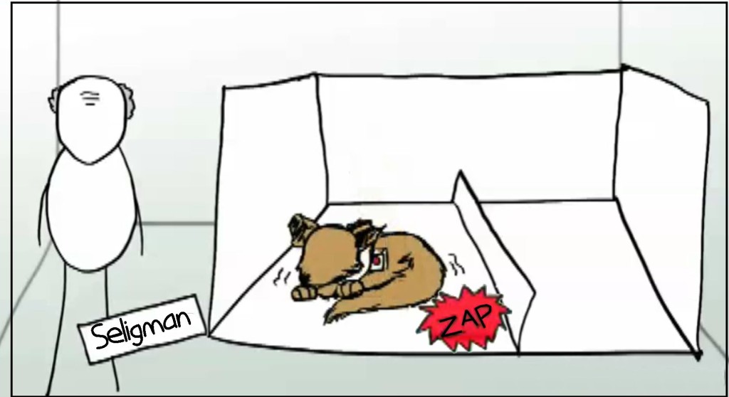
Things are starting to feel simultaneously overwhelming and without much purpose, which is a bad combo for me, since it shoots my motivation right in the foot. I'm like the learned helplessness dog in the cardboard electric shock box- I just lay down and nap because I'm too tired to focus, and because hey, whatever's coming is inevitable right?


Ah well. Nothing to do but keep working.

Gilbert, D. (2014, February 14). Why Japanese Web Design Is So... Different - Design Made in Japan. Retrieved April 19, 2015.

This article's a shorty, but a good-y. It has a lot of issues in it that point me in some good investigative directions for future research. One of the things it pointed out that I didn't know going in was that Japan had a large smart (flip) phone culture going on before the US did, and the cramped, overcrowded pages of popular sites like Rakuten were actually designed that way on purpose. Small text meant that the maximum amount of content was packed onto that tiny mobile screen as soon as the page loaded. Maximum advertising quick is definitely a business strength.

It also confirms what a lot of Japanese culture pieces say- that Japan's red tape fetish knows no bounds. Once there is a set method for doing things, be it how a lolita is supposed to dress, how a salaryman is supposed to conduct himself, or how you design a website, no one really cares to deviate from that standard. Of course there are always exceptions, but whatever the "norm" is, that's what folks like to stick to, even if a better way comes along.

Additionally, this piece demystified a trend I had noticed visually, but couldn't put my finger on- a heavy graphics presence. This article points out that character languages like Japanese and Chinese that have thousands of characters must have each character designed individually in any new font creation. This is expensive and time consuming, so there aren't as many choices out there to make text stand apart. Additionally, bold and italics are uncommon in Japanese, so making text stand out with an image is much easier than differentiating with format in English.

Inspecting the elements turns up some pretty neat info, too. I never thought about it, but HTML source code was invented in English, meaning that to program using it, you have to know programming language (which is doubly non-native for any non-native English speaker!) The code I can get to on the wildly popular Rakuten.co.jp (this Japan's Amazon) is mostly in English, with the exception of a few lines with short bits of Japanese like "<!-- /おすすめ特集 -->" which after a quick run through on Jisho, I /think/ means recommendation report. No idea how it fits in, but it's definitely something I never considered before! I couldn't imagine having to learn Japanese coding language if I wanted to put up a website, so I think such a thing is probably a pretty difficult barrier and definitely affects how effective some designers can be.

Tuesday, April 7, 2015

ENGL685 - UPD8

I am 10 behind. I counted. Please kill me.

So collecting and gathering data seems to be the hardest thing pretty much ever. Aside from submitting a proper IRB, maybe. There are tons of hidden pitfalls, like consent, and availability (made more difficult by a language barrier) and in general everything is pretty much awful right now. We just did project presentations in Dr. Romberger's class and it basically cut my ideas up pretty bad. Shanked 'em right in the kidneys.

Because I'd had such a hard time finding syllabi in English but written for Japanese students by Japanese professors, I decided to just limit my thesis: I'd decided to only look at the rhetorical differences between ODU and Kitakyushu University syllabi. I thought this would solve my problems and I could finally, /finally/ begin making some kind of forward motion. Baby Pilot is getting a rash on his bom-bom sitting on the hot tarmac.


Well NOPE. That presentation ended in the phrase "we need to see if the data you've gathered is worthy of the questions you're asking of it".

Oh ok. I'll just be here then. Contemplating all the decisions leading up to this point in my life and how alcohol is relatively cheap and readily available. That's cool.

It's not that these things are natural, or valid...of course they are. If they weren't, it wouldn't be so crushing every time I feel like I have to start over. Or change lenses. Or find new questions. Again. If it were arbitrary things that I had to change just to make the grade (while knowing they were malarkey) then it'd be fine.

It's just the most frustrating process ever because it feels like I'm spinning my wheels. Every time I want to move forward, I don't think I know how. When I think I know how, I misstep and have to go back where I was.

It's like red light green light, but instead of game over when you get caught, you just have to go back to where you were standing one full turn ago.

Also, it's like red light green light if you were /really/ shitty at red light green light.

I will add the bibs later. All this ranting has made me feel sad. :(


Monday, March 23, 2015

ENGL706 - Belated Tidings of Annotation

I'm so sorry- forgive me Oprah, Jesus, and also Tom Cruise

George, D. (2002). Visual Communication in the Teaching of Writing. College Composition and Communication, 4(1), 11-39. Retrieved from JSTOR.

In this piece, George refers to the current culture as “aggressively visual” which is a term I adore. I want to use this as part of my basis when asserting that syllabi should have a visual design steeped in good rhetoric. Students may not be able to access the document in the multi-faceted layers that a practiced rhetorician can, but having been raised on images, they will come “pre-programmed” with the cultural brainwashing of good and bad visual design. The things that are well designed stuck, and so a good syllabus should join those ranks no matter its purpose or country of origin.

This idea of visual rhetoric being prevalent in culture also applies to online syllabi and calendars, which I would like to analyze on the ODU end of my project. Without the necessary visual literacy, how is a student to know a hyperlink on sight, or what the difference is between a menu bar and a context menu? This will be document specific, but those “moving parts” in e-syllabi are part of the visual culture that upcoming students are raised in.

On page 26, she makes the argument that web pages must be “navigable” and that this ties into graphic design heavily. Although an online syllabus need not necessarily be a web page, I would argue that it, too, must be navigable. Syllabi usually have several pages, and a student who struggles to find information in an ill-formatted document sans bolding, highlighting, or proper paragraphs and spacing, will not use the document for its intended purpose. While a little different than a web page’s navigation bar, I think the coherent thread of thought for “getting around” on them is similar.

Likewise, George’s ideas about what does and does not constitute a visual argument are lax without being nonspefic. She says “All sorts of visuals make assertions and develop those assertions with visual information” which is absolutely true of syllabi. Even in the JP syllabus, there is a visual argument made by the table the information is presented in (albeit a less hearty argument than some of the ODU syllabi I have):


Nanotech.png

The Japanese syllabus mostly replies on color usage and layout- two tools out of a full box to choose from. I look forward to seeing if the use of less stylizing comes with shifts in purpose, or if this is a cultural difference (since Japan has ways of emphasizing characters that the US does not). This in itself is a visual argument that only highlights the section headers. Down below this screen grab is a numbered list of sections that will be covered, which is also a part of the visual argument. Even then, since the list is not indenter, nor any part of it set apart from the others, it reads as a block of undistinguished text and implies no one section is any more important than the others.

All in all, although this text focuses on the composition classroom, and the history of visual argument’s growing importance in teaching, there are small pearls of wisdom RE: the importance of the visual argument, and of coherency that are extremely important.

Wednesday, March 18, 2015

ENGL706 - Connect ALL The Things!

So Kress talks about different genres in the same "text" that take on different shares of the communicative burden, which is actually an interesting concept. I'd say any student who has ever written anything remotely hypertextual, or who has included an infographic/chart to represent something they've written about has experienced the singular pleasure of necessary appendixes. These vial elements often help make a point simply by existing as factual proof to support an argument that at least, in part, is visual. Kostelnick talks about Tufte's beliefs in his "The Visual Rhetoric of Data Displays: The Conundrum of Clarity" especially the "lie factor". This reminded me of the students, and how each of them diagrammed the onion slide in their lab reports in Kress' readings. After all, neither of the students aimed to be misleading in what they drew. Rather, one gave a more literal interpretation (still informed by the teacher's verbal instruction) and the other interpreted what she saw into a larger diagram that implied representation by being incomplete at the edges. If neither is intended to mislead (and most likely, objectively speaking, neither is fully "incorrect") then how can they be classified? Which is "more" or "less" clear?

Thinking more about these diagrams,  Welling's work on"Ecoporn"also comes to mind. Could the consumer produced diagram of the human eye count as a subgenre of Ecoporn? It provides its own brand of fantasy about the human body. The colors are saturated higher, the lines and layouts cleaner than a human body- often, when dissecting, what a chart looks like and what you find inside a once-living creature seem like apples and oranges. In this way, it is designed for the same kind of "quick, easy visual consumption" as pictures of sunsets and rainforests that casually leave the truth of the place out of frame are. Even if ecoporn isn't the correct term (although I feel like an argument can be made for human bodies and organisms to be self-contained ecosystems on a microscopic level) then I do believe that both of these concepts have similar themes when it comes to what can make them and their design problematic.

Ideas (in the form of questions)


  1. Can commercially marketed scientific diagrams be considered as a type of ecoporn, given that they are both constructed for the same type of consumption? I think this is a fascinating idea, since it contains the argument that purpose = grounds for classification. This might all come down to semantics in the end.
  2. Is there a way to negate textual power entirely and still have a functional document? Textual hierarchy dictates what is more and less important (like numbered lists, bullets, bolding, etc.) but is there a way to avoid this prioritizing of somethings over others without sacrificing clarity? (yo creo que no- I think in lists and outlines and see a world without them as anarchy. It'll be interesting to see what the classmates think).
  3. Has the advent of digital media brought on a new wave of text/image meaning sharing? Is it more pervasive now than it was 10 years ago? 20 years ago? (that's only the 1990s *shudder*). Images can now be created and shared much more quickly than before, so does something like a meme fall under this same umbrella of multimodal thinking? (MEME STUDIES. Bring it on.)

Questions (also in the form of questions)

  • Does delegating that all things have multiple layers of analysis in an effort to diminish the need to label mixed genre pieces make accessing multimodal messages more difficult for visual rhetoric scholars? A lot of VR is based on contextual and cultural understanding, so adding a two-tier layer system seems to add a lot of extra work into the equation.
  • When trying to get across a complicated message or concept, does splitting the meaning between a strictly visual and strictly textual delivery method make for good VR? That is to ask, does it usually get the point across better than strictly one method or the other? This may be a type of study that has been measure in a scientific way, but I'd even be interested in opinions here. Does the visual/textual aid combo help you, personally?
  • If the type of information is the same, but the delivery method is different (process list versus narrative account), is either one more or less accurate? I guess this depends on the instructions given, and the purpose. Is it also contextual? Like whether it's on a lab report or if you're explaining a lab experiment to a friend so they can do it at home later?